Private Label Sunglasses Artwork Prep
This guide is for brand owners, importers, distributors, and retailers buying custom sunglasses in volume. It explains the artwork rules that decide whether a logo prints cleanly on temples, lenses, pouches, and packaging, or turns into rejects during bulk production. Give the factory the right files, sizes, tolerances, and approval marks before sampling. That is how you cut rework, protect lead time, and avoid finding a problem at 1,000 pairs that should have been caught at 10.
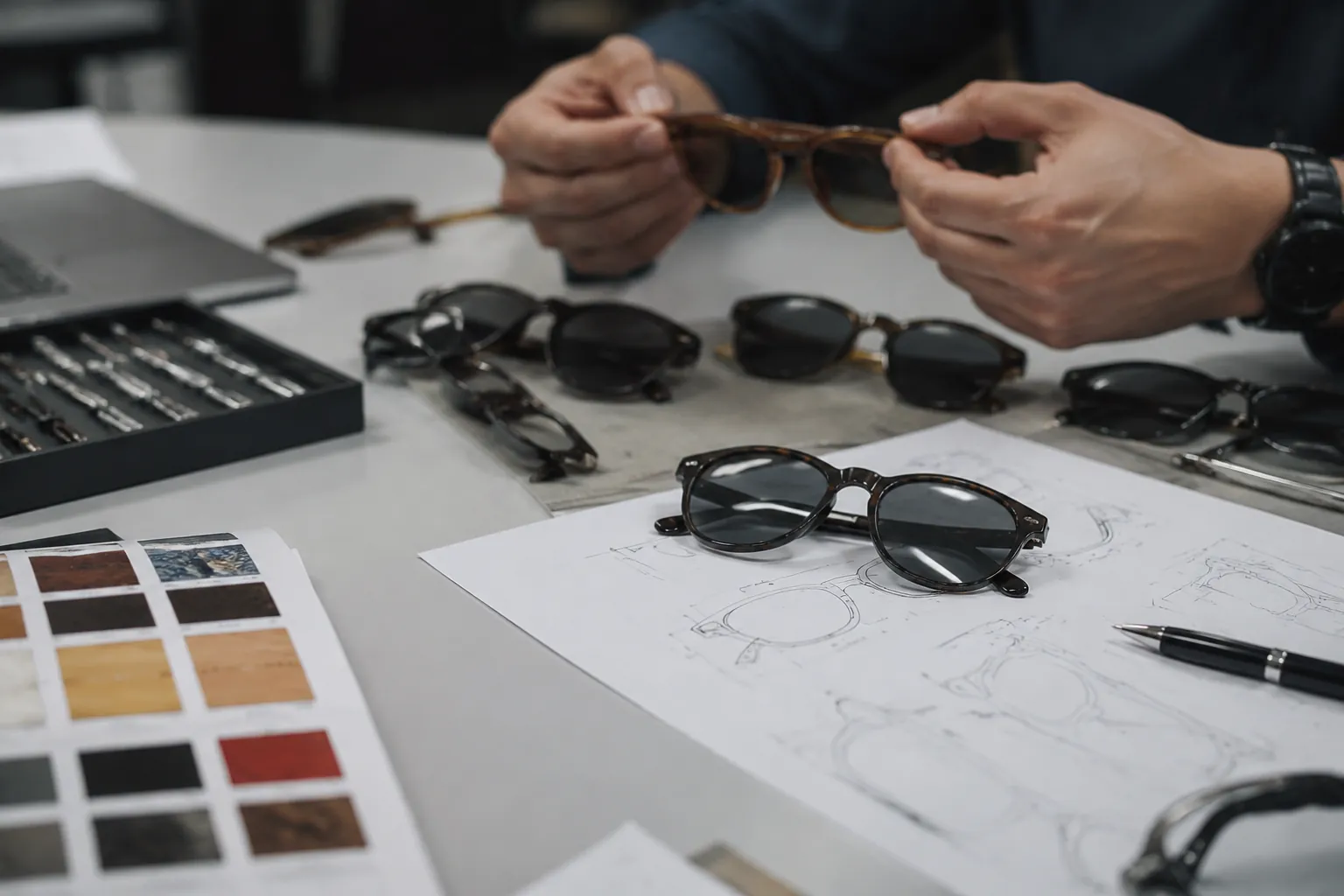
Start with the decoration method
Most artwork failures begin with the wrong assumption: one logo file can be used everywhere. It cannot. The mark that looks fine on a website may fail on a 6 mm temple face, blur on textured rubber, or distort across a curved acetate arm. Start with the process and the exact location. Not the logo.
On sunglasses, the common branding points are the outer temple, inner temple, lens corner, bridge metal, microfiber pouch, hard case, and carton. Each surface has different limits. A thin serif logo may laser cleanly on coated metal but fill in during pad printing on a curved plastic temple. Small reverse text is often the first element to fail. Counters close up. Ink gain shows fast.
Work with the people who will print or engrave the part, not only with a sales contact copying notes into a purchase order. Good pre-production starts with a process map: location, material, finish, decoration method, approved size, and color reference.
- Pad printing: best for one- to two-color logos on plastic temples, coated parts, and some cases; practical when the print area is flat enough and the mark has moderate detail.
- Laser engraving: best for line art and small marks on metal parts or coated surfaces; no Pantone match, but it avoids ink adhesion issues.
- Metal logo plate: good for premium temple branding; needs enough flat area, a secure attachment method, and a design that still reads at small sizes.
- Printed pouch or carton: larger print area and fewer geometric limits than frame decoration, but still requires proper outlines, bleed, and a clean print-safe border.
Define the process first, then redraw the logo to fit it. Do not ask the process to rescue artwork that was never designed for it.
Send files factories can actually use
Send vector files first. The safest master files are AI, EPS, or editable PDF with all fonts converted to outlines. SVG can work, but many factories still route artwork through Adobe-based workflows, so AI or EPS avoids avoidable conversion errors and font substitution problems.
Raster files such as JPG or PNG are acceptable only as placement references or photo mockups. They are not production art. A 1200 px logo pulled from a website header is usually unusable for a 9 mm temple print because edges become guesswork and technicians end up redrawing it. Redrawing introduces real risk: shape drift, incorrect spacing, and accidental simplification that changes the brand.
For every logo submission, buyers should provide three things at minimum:
- Master vector artwork with all fonts outlined and any strokes expanded.
- Color callout by Pantone code where color printing is required, plus black or white fallback if needed.
- Placement sheet showing logo size in millimeters, exact orientation, and the side or component name for each application.
If your brand has multiple approved versions, specify the hierarchy. Example: full logo for pouch and box, icon only for temple exterior, legal brand text for temple interior. Do not ask the factory to decide. That is how inconsistent branding spreads across a production run.
Include a version note in the file name and on the instruction sheet. A naming convention such as BrandLogo_v3_outline.ai and TempleLeft_8.5mm_padprint.pdf removes ambiguity when files move between sales, engineering, and printing. If the artwork pack includes metallic foil, electroplated trim, or a painted frame color near the decoration, ask for a contrast check on the actual substrate. A gold logo on warm tortoise acetate may technically print and still disappear at arm's length.
Use line weights that survive production
Artwork that looks sharp on screen often fails because the smallest features sit below process limits. On sunglasses, usable line weight is governed by plate quality, part curvature, ink spread, surface energy, and operator control. The real question is not what the process can do once. It is what it can repeat across a bulk order with normal variation.
| Decoration method | Safe minimum line weight | Safe minimum gap | Recommended minimum text height | Typical use |
|---|---|---|---|---|
| Pad printing | 0.18-0.25 mm | 0.20-0.25 mm | 1.2-1.5 mm uppercase | Temple logos on plastic or coated surfaces |
| Laser engraving | 0.15-0.20 mm | 0.15-0.20 mm | 1.0-1.2 mm uppercase | Metal inserts, hinges, coated temples |
| Metal logo plate | 0.25 mm raised or recessed detail | 0.25-0.30 mm | Depends on tooling size | Premium exterior temple branding |
| Pouch or carton print | 0.12-0.18 mm | 0.15-0.20 mm | 1.0 mm possible with good contrast | Accessories and packaging |
These are conservative working ranges, not theoretical limits. If your logo includes hairlines, tiny counters inside letters like A, R, or e, or close parallel strokes, ask the factory to issue a production-safe redraw for approval. That redraw should preserve the brand shape while slightly opening gaps and thickening weak strokes.
Small reverse text is a repeat offender. White letters knocked out of a dark print need more breathing room than black letters printed on a light frame. If the logo is under 10 mm wide on a temple, simplify. If it includes more than six words or two lines, it is usually too much for the location unless the surface area is unusually generous.
Before sample production, ask the factory to confirm three numbers: minimum stroke width, minimum inter-letter gap, and minimum safe logo width. Then lock those numbers into the approved drawing. If the print shop will not state them, the artwork is still too speculative for volume production.
Match the artwork to the substrate
Artwork approval is not only about the file. It is about the substrate. Injection-molded PC or TR frames, hand-finished acetate temples, rubber-coated parts, plated metal, and painted surfaces all behave differently under ink or laser. The same vector file may need different handling on each one.
Acetate is attractive because it feels better and machines cleanly, but surface polish and oil residue must be controlled before printing. A glossy acetate temple often needs cleaning and, in some production lines, light surface preparation before pad print adhesion is reliable. Injection-molded parts are more consistent in shape, but some materials have lower surface energy and may need pretreatment or primer to hold ink through abrasion. Curvature matters too. A logo placed too close to a temple taper can distort visually even if the print itself is technically accurate.
Ask the factory these questions before sample approval:
- Is the print area flat, slightly curved, or crossing a radius break?
- Will the logo sit over texture, mold parting lines, screw bosses, or acetate pattern variation?
- What adhesion test is used after pad printing, and what is the pass criterion?
- Will laser engraving expose a base color, raw metal, or only a tone change?
- For metal plates, is attachment adhesive-only, pin plus adhesive, or heat-staked?
Substrate choice controls how much detail you can safely keep. Matte and textured surfaces tolerate slightly more visible line loss because the eye is already reading a rough finish. Glossy surfaces expose every small wobble in registration and every edge break in the ink film. Dark substrates also require more caution with light inks, especially if the print needs one-pass opacity.
Check decoration against the real part whenever possible. A logo approved on a digital mockup can end up too close to the hinge screw, the temple bend, or a texture change once it lands on the actual frame geometry.
Use a buyer approval workflow
If you want clean branding at scale, approve in stages. Do not jump from artwork file to bulk order on faith. A basic control flow saves money and calendar time, and it gives both buyer and factory one version of the truth.
- Artwork review: factory checks file type, outlines, line weight, color references, and placement size in mm.
- Digital markup: factory returns a placement drawing with decoration method and any required thickening, simplification, or registration notes.
- Pre-sample confirmation: buyer signs off on art, location, orientation, and finish description.
- Physical sample: one or more pre-production pieces made with the real process, not only a rendering.
- Bulk standard retention: approved sample or signed photo standard held for QC comparison.
Use the sample window properly. If artwork is incomplete, the sample slot turns into revision time, and bulk timing slips before the order is stable.
For first orders, ask for close-up photos of the logo area under normal light and at an angle. This catches edge ragging, weak opacity, and placement drift that front-on photos can hide. Then define the acceptance rule. Example: logo centered within plus or minus 0.5 mm from the approved datum, no broken strokes, no visible smearing at 30 cm viewing distance, and no adhesive squeeze-out on metal plates beyond the specified edge.
For repeat programs, hold the approved sample against each lot start. That gives the factory a physical comparator and reduces the risk that a new operator interprets the drawing differently. If the brand uses multiple styles, keep separate control sheets by model instead of one master sheet for everything.
Know the cost of complexity
Branding is not free detail. Every extra color, plate, setup, redraw, and special placement affects cost and schedule. Buyers should know where the money and time go so they can choose a method that fits the order quantity and market position.
| Artwork choice | Cost effect | Lead-time effect | Main risk |
|---|---|---|---|
| Single-color pad print, standard temple area | Lowest setup and unit cost | Fastest sample approval | Thin strokes filling in |
| Two-color print with registration | Higher setup and more scrap risk | Longer sampling due to alignment checks | Color misregistration |
| Laser engraving on metal or coated part | Moderate cost, no ink color matching | Usually stable once settings are locked | Low contrast on the wrong substrate |
| Custom metal logo plate | Highest tooling and setup among common options | Adds development time | Weak detail or poor attachment if too small |
Order quantity changes the economics. At low quantities, custom logo hardware, special plating, or multi-pass decoration may be hard to justify. At higher quantities, a cleaner branding method can reduce defect risk enough to pay for itself.
There is also a hidden cost in artwork complexity itself. Every extra approved version means another file check, another placement verification, and another chance for the wrong art to enter the chain. If the logo can be reduced from three colors to one color, or from a filled shape to a line mark without losing brand recognition, the operational gain is real.
Use the least fragile method that still fits the brand. Fancy logos are cheap on a mockup and expensive on a production line.
Keep compliance separate from branding
One avoidable error is mixing decorative branding artwork with compliance language in one crowded temple layout. Certification and product information need legibility. They should not be shrunk to make room for a prettier logo.
For sunglasses sold into different markets, buyers may need model reference, brand name, country of origin marking, importer information, or lens category references depending on destination and packaging setup. Performance and testing claims must match the actual documentation. Use only verified standards tied to the product and supplier, and only where those references are appropriate for that market.
Only use certification references that are actually supported by the product and the supplier's documentation. Common examples include CE EN ISO 12312-1, ANSI Z80.3, AS/NZS 1067, REACH, FDA registration, ISO 9001, and BSCI. Do not place these references decoratively on the frame unless there is a regulatory reason and enough space to keep them readable. In most cases, compliance references belong in packaging documents, test reports, manuals, or carton labeling, not squeezed beside a temple logo at 1 mm text height.
A practical layout is easier to inspect and easier to maintain. Put the brand mark on the outside temple, legal or product information on the inside temple or packaging, and certification references only where supported and necessary. That separation improves print quality and reduces disputes during inspection. It also prevents the common problem where a factory is asked to print tiny compliance text that cannot survive coating, curvature, or routine handling.
When compliance text is required on the product itself, give it the same treatment as logo artwork: vector file, approved placement, minimum text height, and a signed drawing. Do not leave it as a note in the email body.
Send a production checklist with every PO
Serious buyers standardize artwork intake. A one-page checklist prevents most decoration errors before tooling or printing starts, and it keeps sampling focused on production details instead of file housekeeping.
- File: AI, EPS, or outlined PDF attached; no screenshot-only approvals.
- Logo version: exact approved variant named for each location.
- Size: width and height in mm for temple, lens, pouch, case, and carton.
- Color: Pantone code or laser/no-color instruction.
- Method: pad print, laser engraving, or metal logo plate specified.
- Material: frame material and finish noted for each decorated part.
- Placement: left/right side, orientation, and datum reference from hinge or edge.
- Minimum feature approval: line thickening or simplification accepted or not accepted.
- Sample requirement: physical pre-production sample required before bulk.
- QC standard: placement tolerance, adhesion expectation, and visual acceptance rule.
Add two more items if the program matters: whether a signed photo standard is acceptable for repeat orders, and whether alternate artwork is permitted if the preferred method is unavailable. If any field is blank, the risk moves downstream into sampling or mass production. That is where costs rise.
Good artwork prep is not a design exercise. It is production control. The buyer who sends exact files, exact sizes, and exact approval language gets better sample quality, fewer surprises, and cleaner bulk output.
Have a custom sunglasses project in mind?
Send us your styles, target market and quantities and we will return a detailed quote with MOQ, lead time and a sample plan.
Get a QuoteWhy source this from Wenzhou with LumiShades
Wenzhou in Zhejiang Province is widely regarded as China’s eyewear manufacturing capital, producing a large share of the world’s sunglasses. That concentration matters to buyers: a deep local supply chain for acetate sheet, hinges, lens blanks, plating and packaging means shorter component lead times, easier color and material matching, and a workforce with decades of eyewear-specific skill. LumiShades has manufactured in this ecosystem since 2009, and our vertical integration — in-house injection molding, acetate cutting, CNC milling, lens tinting, decoration and quality control — means no part of your order is quietly subcontracted to a workshop you cannot audit.
For international buyers, that vertical control translates into accountability. When a single factory owns every step, defects are traced and fixed at source rather than bounced between vendors, and your specifications survive intact from first sample to bulk. We back this with 15+ years of experience, shipments to 60+ countries, more than 5 million pairs produced per year and a 98.5% on-time delivery rate. Our certifications — CE EN ISO 12312-1, FDA registration, ANSI Z80.3, AS/NZS 1067, REACH, ISO 9001 and BSCI audit — mean the compliance documentation your market requires already exists. Explore our manufacturing capabilities and quality control process to see how this works in practice.
Frequently asked questions
Can I send a PNG logo if it looks sharp on screen? Use PNG only as a visual reference. Production artwork should be AI, EPS, or outlined PDF so the factory can hold exact edges, spacing, and scale in millimeters. A screen-sharp image is not proof that the file can survive printing or engraving. For approval, ask the supplier to confirm the final vector file they will use and the exact logo size on the part before sampling starts.
What is the smallest logo that can print clearly on a sunglass temple? There is no single minimum that works for every product. The usable size depends on the decoration method, substrate, curvature, and the amount of detail in the mark. Ask the factory for the minimum stroke width, minimum gap, and minimum safe logo width for the exact frame material and process. If the logo falls below those limits, simplify the artwork or move it to a larger surface such as the pouch or carton.
Should I approve a digital mockup only, or insist on a physical sample? Insist on a physical sample for any new logo placement or decoration method. Mockups do not show ink spread, contrast loss, curvature distortion, coating interaction, or adhesion performance. A sample is the only reliable check that the process and the artwork are compatible. For repeat orders, a signed sample or signed photo standard can work, but the approval record should still be tied to the exact artwork version and placement drawing.
Is laser engraving safer than pad printing? It can be safer for very small line art on suitable metal or coated parts because it avoids ink adhesion issues. It is not automatically better, because it cannot reproduce Pantone color and may be low-contrast on the wrong substrate. Use laser engraving when the material, finish, and brand requirements support it, and confirm the expected contrast on the actual part before production.
How do I keep branding from delaying bulk production? Send final vector art, Pantone references or a no-color instruction, placement sizes in millimeters, and the decoration method before sampling starts. Ask the factory to return a marked-up placement drawing for sign-off before the sample is made. Bulk production stays on schedule when the artwork package is complete and the approval path is clear; missing artwork data is a common reason sample work has to be repeated.
Ready to start?
Explore our aviator sunglasses or request a quote — our sales team replies within 12 hours.
Request a Quote